You have no items in your cart
Shop our collectionsFree Shipping On Orders $90+
Free Returns
30-Day Trial
Home & Kitchen with Caraway
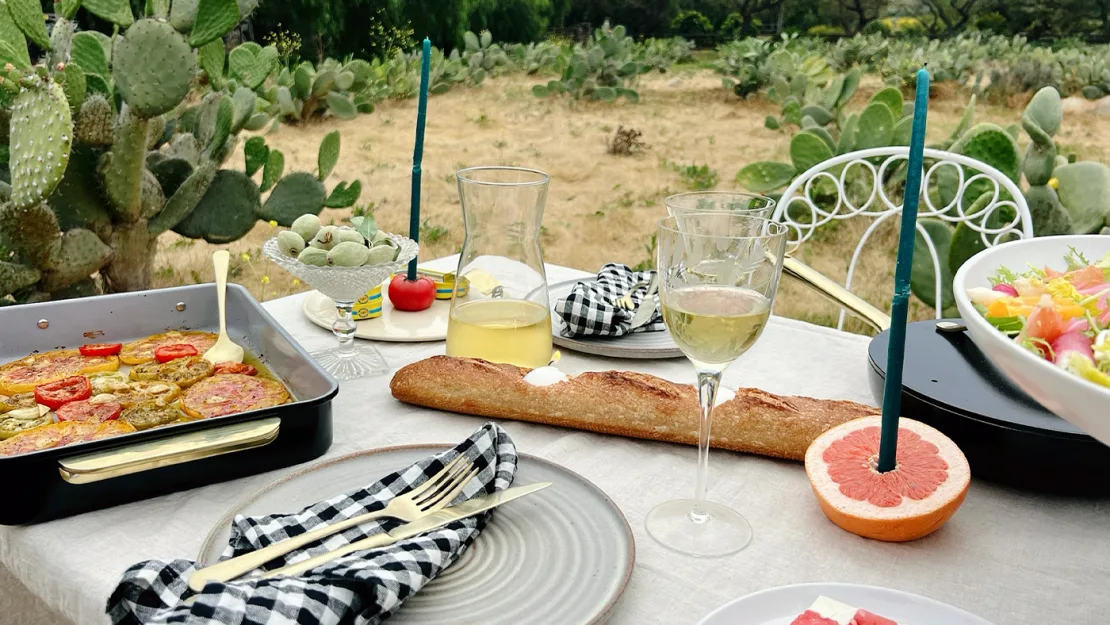
Meals are at their best when they include all colors of the rainbow. When building the palette for your kitchen, don’t be afraid to paint outside the lines. Here are some fun and surprising combos to give your kitchen (and food) the pop of color it deserves.
The only thing bolder than a surprising design pairing is the willingness to say, “These things go well together!” But how do you know when you’re working with yin-and-yang magic? When you’re looking to add a pop of color that still works with the rest of your home, here are five surprising color pairings that will keep your eyes engaged.
“Is your shirt white or just dirty?” Whites and creams (or “eggshells,” as your sophisticated friends have called them) have been frenemies for eternities, but a thoughtful eye can unify their brightness and warmth. For an elevated-yet-grounded look, consider adding cream curtains or fabrics to an otherwise white-walled space. It will help to dilute the vibrancy, while maintaining an otherwise clean feeling. Classy!
If yellow is “too much” and gray is “too boring,” then combining yellow and gray will make you the most popular person in your (1-bedroom) apartment. It’s simple math on this one, really. Pops of yellow amidst a soothing gray backdrop make for a perfectly quaint home environment. Breakfast nook, say?
Can we all agree that certain colors being “masculine” or “feminine” is an outdated concept? Great! Let’s move on. Navy blue is the ultimate brooding foundation to play off of. Adding even just a burst of coral will have any person entering your home (safely during quarantine) laser focused on your ability to get creative. Make sure to make your coral item something you’d want people to focus on – a pillow, landline phone (?), accent bowl, or a Perracotta Sauté Pan – so you seem like an interior design expert.
“Sage?! Yellow?! What are you, my grandma?!” No. But maybe your grandma had the right idea about keeping things interesting when you’re trying to make your space “dance.” Color balancing is all about warm vs. cold, grounding vs. uplifting, classic vs. bold. You get it. Sage green is grounding and deeply rooting, while yellow reminds you that you can still have a lot of energy with your feet to the ground. These two colors are a fun combo because you can mix up which one gets to be dominant. Yellow cabinetry with sage green plants? Or maybe a sage green couch with a yellow accent blanket. The stage is yours!
You may have heard the story of the 14-year-old young man who went to Homecoming wearing an oversized rustic orange button-up while his date wore a hot pink dress. (You haven’t heard it; the story is mine; it happened to me; I should clarify I am now gay). Turns out, this clash isn’t always the case! If you choose the right tone of contrasting oranges and pinks, you can make something stunningly unique.
The pairing is so permissible that one of Caraway’s most popular colors is a direct melding of the two — Perracotta (pink and terracotta).Now that Caraway pots and pans are available à la carte, you can bring the dynamism of mixing and matching color blocks like the modern Mondrian you are.
Free Shipping On Orders $90+
Free Returns
30-Day Trial