Almost there! You're $90.00 away from free shipping
Your Cart is Empty
Get started with the Caraway essentials!
Free Shipping On Orders $90+
Free Returns
30-Day Trial
Home & Kitchen with Caraway
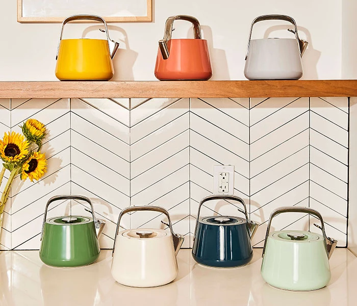
Color is more than an aesthetic choice at Caraway . It’s part of how we design for joy. From the soft blush of Perracotta to the earthy calm of Sage, every hue is chosen to make your space feel as intentional as the meals you cook.
Here’s how our signature shades came to life and why they continue to set Caraway apart.
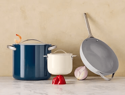
When it came to the Cookware Set’s classic colors, we wanted to break away from the black-and-grey standards of the market. Kitchenware doesn’t have to blend into the background. It should bring warmth, balance, and beauty to everyday routines.
We worked with a professional color specialist (yes, that’s a real job!) to develop our palette. Each hue was crafted from custom Pantone swatches, refined through rounds of testing and tweaking until the tones felt distinctly Caraway: modern, timeless, and easy to mix and match.
Color, for us, is functional design. It’s what makes your kitchen feel like your space: calm when you need it, vibrant when you want it, and always cohesive.
Caraway’s most-loved hues (Perracotta, Sage, and Marigold) weren’t chosen by accident. Each shade tells a story of balance, warmth, and clean living.

A Caraway original, Perracotta is where modern design meets comfort. Inspired by traditional terracotta, we softened the tone into a fresh, rosy clay that feels warm yet refined. It’s a color that grounds the kitchen without overpowering it. It’s inviting, balanced, and versatile enough to complement both neutrals and bold accents.
Fun fact: Perracotta was developed uniquely for Caraway. It went through multiple iterations—Watermelon, Coral, Raspberry, and Rose—before we landed on this just-right shade. The goal? To create a color that stands out on your countertop while blending effortlessly with the rest of your home.
Perracotta remains one of our most recognizable hues, and one of the reasons our cookware has sold out time and time again.

If Perracotta is warmth, Sage is calm . This muted green brings a sense of ease to your kitchen, inspired by the freshness of herbs and the stillness of nature. We softened the original tone to feel timeless rather than trendy, something that complements any design style, from minimalist to cozy farmhouse.
Sage was created for cooks who want their kitchen to feel balanced and restorative. It’s a visual reminder that healthy living starts with slowing down, taking time to chop, stir, and savor.

Marigold captures the energy and optimism of cooking itself. Bright without being overwhelming, it adds a sunlit glow to your kitchen. This shade was designed to feel joyful and alive, making it perfect for anyone who loves color that inspires creativity.
Like the flower it’s named after, Marigold brings a touch of warmth wherever it goes. It pairs beautifully with our neutrals like Cream or Slate, adding just the right pop without stealing the show.
Color sets the tone for how you cook, connect, and create moments that feel good to live in. Our signature hues were made to bring calm and joy to everyday cooking while reflecting what matters most: clean design, thoughtful materials, and a healthier home.
Ready to add some color to your countertop? Explore our cookware , bakeware , and kitchen essentials designed to make your kitchen feel as good as it looks.
Sources:
Almost there! You're $90.00 away from free shipping
Get started with the Caraway essentials!
Free Shipping On Orders $90+
Free Returns
30-Day Trial